Website Redesign
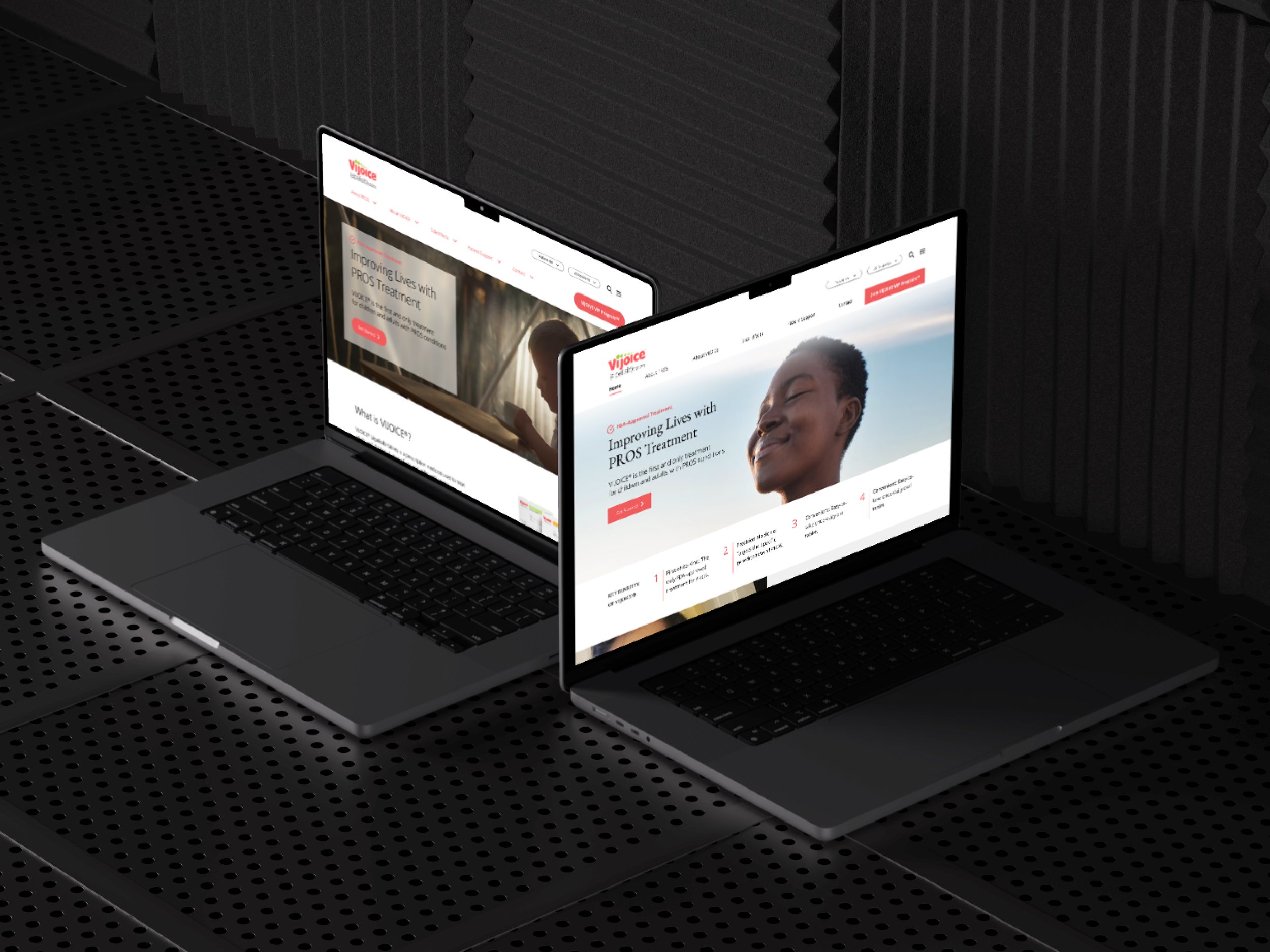
VIJOICE® Homepage Web Experience Enhancement
Company
VIJOICE®, Novartis
Role
Product Designer
Scope
40 hours dedicated to the development of website
Tools
Figma / Adobe XD / Maze / Optimal Sort / Zoom / Google Suite
Project Overview
The primary goal was to overhaul the VIJOICE® homepage, transforming it into a more engaging, visually appealing, and user-friendly platform. The redesign aimed to not only reflect the innovative spirit of VIJOICE® as a treatment but also to enhance the overall user experience for patients, caregivers, and healthcare professionals seeking information about PIK3CA-Related Overgrowth Spectrum (PROS).
Ask
The project is to re-design a homepage that enhances user experience, incorporates VIJOICE®'s branding, and addresses user pain points.
The process
Empathize → Define → Ideate → Prototype → Test
Exiting Landing page
The Problem
The current VIJOICE® homepage presents significant challenges, including complex navigation, information overload, limited visual appeal, inconsistent branding, and accessibility issues.
Goals and ObJectives
My goal is to create a modern, user-centric homepage that aligns with VIJOICE®'s branding while improving user engagement and information accessibility.
Simplify Navigation
Enhance Visual Appeal
Reduce Information Overload
Ensure Consistent Branding
Improve Accessibility
User Interviews
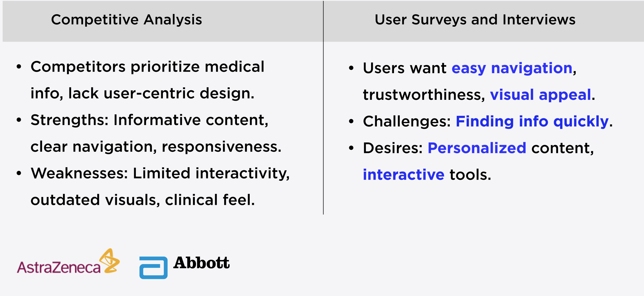
I conducted a series of user interviews to deeply understand the challenges and needs of our target audience—parents and healthcare providers managing rare pediatric diseases. The goal was to uncover actionable insights that would guide our UX/UI design to be as intuitive and supportive as possible.
Methodology
I engaged with 5 participants, including 3 parents and 2 pediatric specialists, using a semi-structured interview format. Each session lasted approximately 45 minutes and was conducted remotely, ensuring a comfortable environment for participants to share their thoughts and experiences.
Key Findings
Parents often feel overwhelmed by the medical information they receive, indicating a need for a more simplified and accessible way to understand their child’s condition.
Healthcare providers emphasized the importance of a reliable tracking system within the app to monitor patient progress over time.
Impact on Design
These insights led me to design the Vijoice app with a focus on clear, easily navigable information architecture and a dashboard that prominently displays key health indicators, simplifying the user journey for stressed parents and busy professionals.
User Research Summary
The Problem Statement
The VIJOICE® homepage currently presents a dual challenge: it lacks the visual dynamism to immediately engage users and the intuitive UX framework necessary for seamless navigation. This disconnect not only dilutes the brand's innovative identity but also impedes user engagement, calling for a redesign that harmonizes aesthetic allure with user-centric functionality.
The process
Empathize → Define → Ideate → Prototype → Test
Key Users
Primary User Persona
Sarah Thompson: Demographics: 38-year-old Marketing Manager from San Francisco.
Needs: Clear, accessible information on PROS for her son; prefers straightforward, jargon-free content.
Behavior: Limited time, relies on intuitive navigation and appreciates visually engaging websites.
Secondary Users
Healthcare Professionals
Seek detailed, scientific information about PROS treatments.
Require efficient access to clinical data and patient resources.
General Public
Individuals seeking basic information about PROS.
Prefer easy-to-understand explanations and general treatment overviews.
User Persona Development
Sarah is a busy professional and mother to a son recently diagnosed with PROS. She seeks clear, concise information about the condition and its treatments. Faced with limited time, Sarah values a website that offers straightforward, jargon-free content in an intuitive and visually engaging format. Her needs guided the user-centric design of the VIJOICE® homepage, ensuring it's not only informative but also easy to navigate and visually appealing.
The redesign focused on creating a harmonious balance to cater to the diverse needs of these key users, ensuring the VIJOICE® homepage is informative, user-friendly, and visually appealing.
The process
Empathize → Define → Ideate → Prototype → Test
The Solution
Design approach
UI Set
Lo-Fi Screens
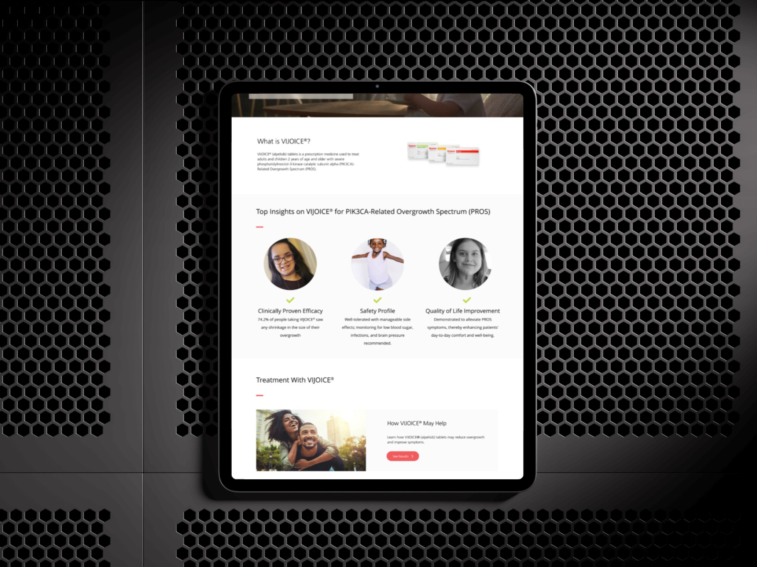
The Lo-Fi wireframes focused on establishing a clear hierarchy of information, ensuring that users would not feel overwhelmed when opening the app.
Hi-Fi Screens
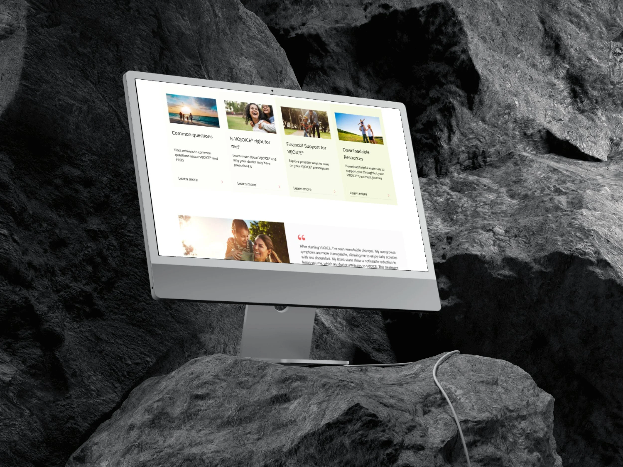
The final design includes a comprehensive set of high-fidelity screens that demonstrate the app’s functionality across various devices. Below, I highlight the core screens designed for desktop and mobile use.
The process
Empathize → Define → Ideate → Prototype → Test
Direction 1
The process
Empathize → Define → Ideate → Prototype → Test
Direction 2
The process
Empathize → Define → Ideate → Prototype → Test
Issue Identified
The "Explore More" Call-to-Action (CTA) lacked descriptive text for assistive technologies.
Importance
Accessibility in web design ensures that all users, including those with disabilities, can navigate and interact with a website effectively. Descriptive text for CTAs is crucial for screen reader users, as it provides context and understanding of the action they are about to take.
Usability Testing
To validate the design, I conducted usability testing focusing on navigational ease and information accessibility within the Vijoice. This phase was crucial for ensuring that the app not only looked good but also worked well for end-users.
Process and Participants: Using a think-aloud protocol, I tested the app with 5 new participants who matched the initial user interview profiles. This process helped me observe real-time reactions and gather qualitative data on user experience.
Findings and Improvements:
Users found some medical terminology confusing, leading me to integrate a glossary feature accessible from every screen.
The initial layout of the health tracking dashboard was cluttered, which I simplified in the next iteration based on user feedback.
User Quotes and Reactions:
"I really appreciate how everything I need to know is just a tap away—makes it less daunting," shared one parent.
"The glossary is a godsend for quickly clarifying terms without disrupting my workflow," mentioned a pediatric nurse.
Accessibility Test Consideration
A seamless and efficient booking experience is paramount for younger travelers.
Real-time updates and notifications are crucial for enhancing user trust and satisfaction.
Balancing innovation with established branding can be challenging but is essential for maintaining brand identity.
Solution
To address this, I proposed adding more descriptive text to the "Explore More" CTA. Instead of a generic label, the CTA would include text that clearly describes what users will find or achieve by clicking the button, such as "Explore More Treatment Options" or "Learn More About PROS Treatment". This change would make the website more inclusive and user-friendly for visually impaired users and those relying on screen readers.
Impact
Implementing descriptive text for CTAs not only enhances the site's accessibility but also aligns with best practices in UX design, ensuring a more comprehensive and inclusive user experience for all visitors.
Key Learning
Human-Centric Design: Incorporate real patient stories and interactive journeys.
Impactful Interactions: Introduce animated efficacy graphs and interactive treatment timelines.
Strong Branding: Ensure that the VIJOICE® logo and primary brand colors are prominently featured throughout the design. The branding should be consistent across all pages to reinforce brand recognition.
Premium Feel: Employ sophisticated color schemes, elegant fonts, and high-quality imagery.
Enhanced Usability: Simplify navigation and ensure a responsive, accessible design.
